
As policymakers, employers, and patients increasingly struggle with rising health care costs, there is a lack of clarity around the actual price of health care services and why those prices are so different. Recent efforts have focused on greater price transparency as a way to impact growing prices. A range of proposals from both Congress and the White House seek to shed more light on the confusing world of health care pricing. For example, the Department of Health and Human Services recently solicited comments on a proposal to require hospitals to reveal their negotiated rates for specific services with health insurance companies.
In this volume of the Healthy Marketplace Index (HMI), funded by the Robert Wood Johnson Foundation, we analyzed a subset of these negotiated rates to report prices for 6 commonly-used services among individuals with employer-sponsored insurance and found striking variation.
Across metro areas, we saw up to 25-fold variation in median prices of the same services:
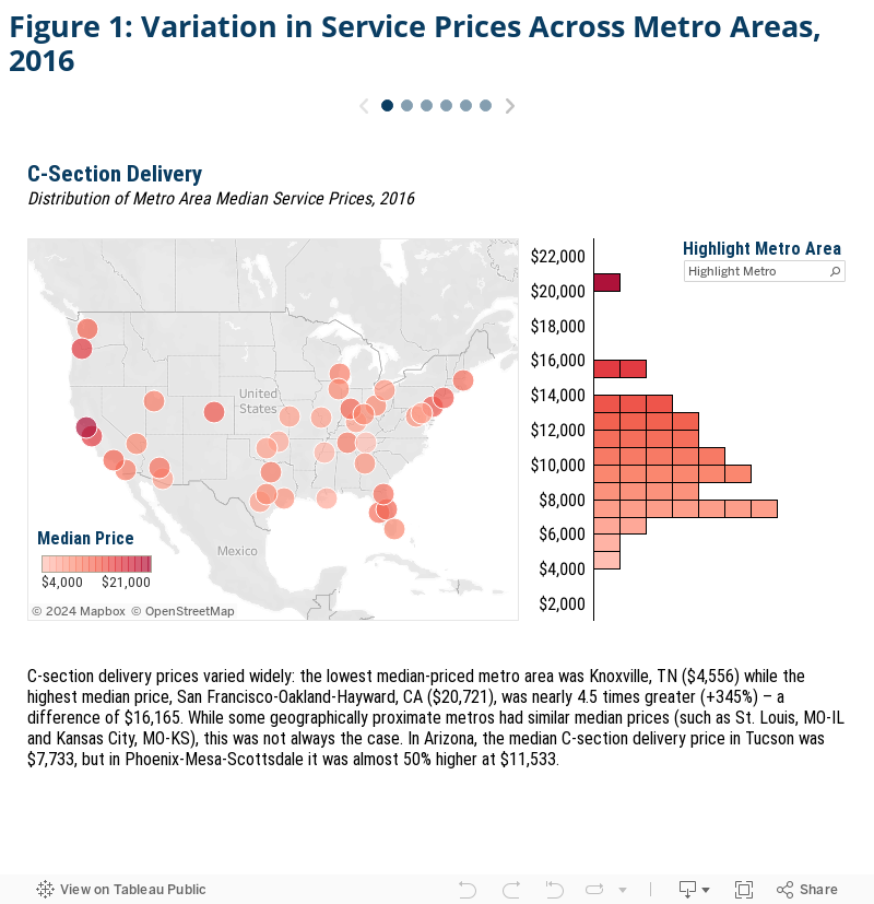
- The median price for C-sections in San Francisco-Oakland-Hayward, CA ($20,721) was nearly 4.5 times that in Knoxville, TN ($4,556).
- A common blood test in Beaumont, TX ($443) costs nearly 25 times more than the same test in Toledo, OH ($18).
- Established patient office visits had median prices 3 times larger in Anchorage, AK ($165) than in Miami-Fort Lauderdale-West Palm Beach, FL ($60).
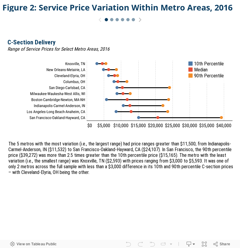
Service prices also varied widely within metro areas – we found up to a 39-fold price difference for the exact same service, even after removing the top and bottom 10% of prices to exclude outlier effects:
- The median price of a vaginal delivery in Boston-Cambridge-Newton, MA-NH was $8,074 but ranged from $4,701 at the 10th percentile to $15,973 at the 90th percentile, a difference of $11,272.
- The price of a screening mammogram varied by more than 4-fold in Allentown-Bethlehem-Easton, PA, where the median price is $177.
- Some new patient office visits cost over 3 times more than other new patient office visits in Minneapolis-St. Paul-Bloomington, MN, where the median price was $229.
How we compared service prices across metro areas
The first volume in the Health Care Cost Institute’s (HCCI) HMI examined overall health care prices in 112 Core Based Statistical Areas (CBSAs), or metro areas, across the country. We created a price index for three distinct service categories – inpatient admissions, outpatient visits, and professional services – each comprised of a set of common services held constant throughout the study. The price indices revealed substantial variation in overall and category-specific prices, but by construction, mask much of the nuance within those service categories. As other studies have found, there can be variation within service category prices within certain areas. For example, an area may have relatively high average inpatient prices but relatively low prices for a given inpatient service such as a knee replacement (and vice versa).
To demonstrate the extent of price variation within metro areas, we examined prices for two selected services from each of the three service categories. We measured prices for each service as the total allowed amount associated with each claim – that is, the sum of the actual insurer and patient out-of-pocket expenditures.
Overall, we found widespread variation in our selected service prices across metro areas. Even within metros, commercially-insured patients often paid vastly different prices for the same services in the same metro. The differences in price were not consistent geographically or even within categories of service. These findings align with previous literature on variation in health care prices both across and within regions — oftentimes within providers and speak to the complexities of understanding commercial health care prices.
We studied the following services:
- Two types of childbirth admissions—the most common inpatient admissions in the HCCI dataset in 2016: C-section delivery and vaginal delivery.
- Two types of frequently performed lab tests: a common blood test (comprehensive metabolic panel) and a screening mammogram (bilateral screening mammographies with computer-aided detection).
- Two types of office visits that accounted for 11% of all professional services in 2016: established mid-level expanded problem office visit, new patient mid-level expanded problem office visit.
For detail on the membership, utilization, and geographic health care provider density thresholds required, see the Data and Methods section. Additionally, all of the prices reported in this analysis are available for every metro area as a separate data download.
Section 1: Up to 25-fold variation in median prices for the same services across metro areas
We first compared each metro area’s median selected services prices to the corresponding prices in every other metro. We found substantial variation in prices for the same services across metros, even in metros that were relatively close in geographic proximity. Click the arrows in the figure below to view each selected service.
Section 2: The same service could cost up to 39 times more, even within the same metro area
We found wide variation not only in service prices across metro areas, but within metros as well. Some difference in prices was to be expected because of differences in factors such as the cost of living and other input costs. However, the magnitude of price variation for the same service within some localities was truly striking. We found that, even after excluding the top and bottom 10% of prices to moderate any outlier effects, the prices for the same service in the same metro varied by as much as 39-fold in relative terms (blood tests in Tampa-St. Petersburg-Clearwater, FL) or by $24,107 in real dollar terms (C-section deliveries in San Francisco-Oakland-Hayward, CA).
To explore these within-metro area differences, we chose 10 metros for each selected service– the 5 metros with the smallest price variation and the 5 metros with the largest price variation. We plotted the 10th, median, and 90th percentile prices within each metro side by side. This gives us a clearer picture of the range of prices that were paid in a given metro. A larger range indicates more variance in price and vice versa.
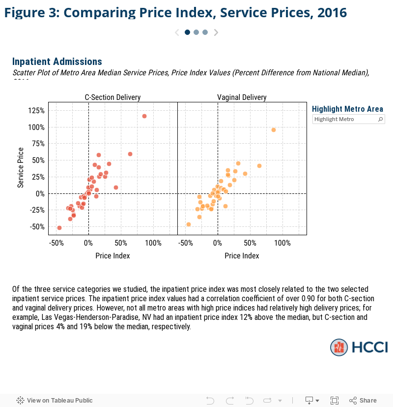
Section 3: Metros with higher overall price levels tended to have higher service prices
Finally, we compared the prices for the 6 selected services to our overall price index (HMI – Price Index) to determine whether the selected service prices aligned with corresponding overall prices in those areas. We found fairly strong correlations between price index values and median selected service prices for inpatient and professional services, meaning that, for the areas we studied, these 6 service price findings were similar to the broader service category price trends. However, there were some exceptions, like Las Vegas-Henderson-Paradise, NV, which had high inpatient prices in general, but below average prices for both types of child deliveries studied, specifically. Likewise, Los Angeles-Long Beach-Anaheim, CA’s overall professional prices were slightly above average, but had some of the lowest prices for both office visits studied.
It is not necessarily surprising that the price index values and specific service prices should be so highly correlated for both inpatient and professional services, more so than past literature. This brief explores some of the most prevalent services within each category of service and, as a result, were more heavily weighted in the computation of both indices. These similarities were also potentially expected given that both sets of selected services were similar: both inpatient services were types of childbirth (with a median price correlation coefficient of 0.94) and both professional services were forms of office visits (0.96 correlation coefficient).
The scatter plots below graph each metro area’s relative specific service price on the X-axis and their corresponding relative service category price index on the y-axis. To facilitate comparisons between the two measures, we report both the price index level and the median price of each service as the percent difference from their respective national medians. So, a metro with a high service price and price index value would be located in the upper right quadrant.
Conclusion
The HMI – Price Index is an important resource for stakeholders to establish and benchmark prices in their areas in order to more accurately identify the drivers of high (or low) local prices, and for national policymakers considering ways to reveal or impact prices. This brief goes past the overall price indices and highlights the dramatically different prices that commercially-insured individuals pay for the same health care services. As we and other publications have found, there is almost as much price variation for these services within markets as there is across markets.
Methods Note
The service claim level analytic data set used for this analysis is a subset of that used for the Healthy Marketplace Index (HMI) reports. For a complete explanation of how the HMI data set was constructed from the entire Health Care Cost Institute (HCCI) commercial claims database see our HMI methodology document. From this service claim level data set, we pulled all the claims associated with two selected services from each of the three categories of services for a total of 6 services. The selected services were identified by their service codes; DRG for inpatient admissions and the combination of CPT code and CPT code modifier (referred to as “CPT code” hereafter, however all CPT code modifiers were blank) for outpatient and professional services. The services and corresponding service category and identifying service code are as follows: C-section delivery (inpatient, DRG 766), vaginal delivery (inpatient, DRG 775), comprehensive metabolic panel (outpatient, CPT 80053), bilateral screening mammography with computer-aided detection (outpatient, CPT G0202), established patient, mid-level office visit (professional services, CPT 99213), and new patient, mid-level office visit (professional services, CPT 99203). These services were selected due to their high prevalence in the HCCI data.
The price for each service claim was the sum of the allowed amounts (the actual amount paid to the providers including any insurer payments and patient cost sharing) associated with that service claim’s individual, common dates, and service code. For inpatient admissions, the price reported does not necessarily encapsulate the entire cost of a typical admission for a given service code as there may exist other ancillary services (such as anesthesia or other professional services) that are not billed under the same DRG code. Additionally, while the specificity of CPT codes prevent the prices reported from excluding additional costs for that service, additional services provided to the individual on the same day would not be included in this analysis’ price measures. The 10th percentile, median, and 90th percentile prices reported are calculated as the relevant percentile of the prices paid for a service within the relevant CBSA in the relevant year, regardless of provider.
Our final CBSA analysis sample was selected from the broader, 112 CBSA sample used in the HMI reports. We only report price measures for CBSAs with both sufficient data coverage and service prevalence for each service we report. We then limited our sample CBSAs to only those which met the relevant thresholds for both selected services within each service category. Our final analysis examined inpatient prices in 39 CBSAs, outpatient prices in 93 CBSAs, and professional service prices in 46 CBSAs.